
WORLD CUP COFFEE
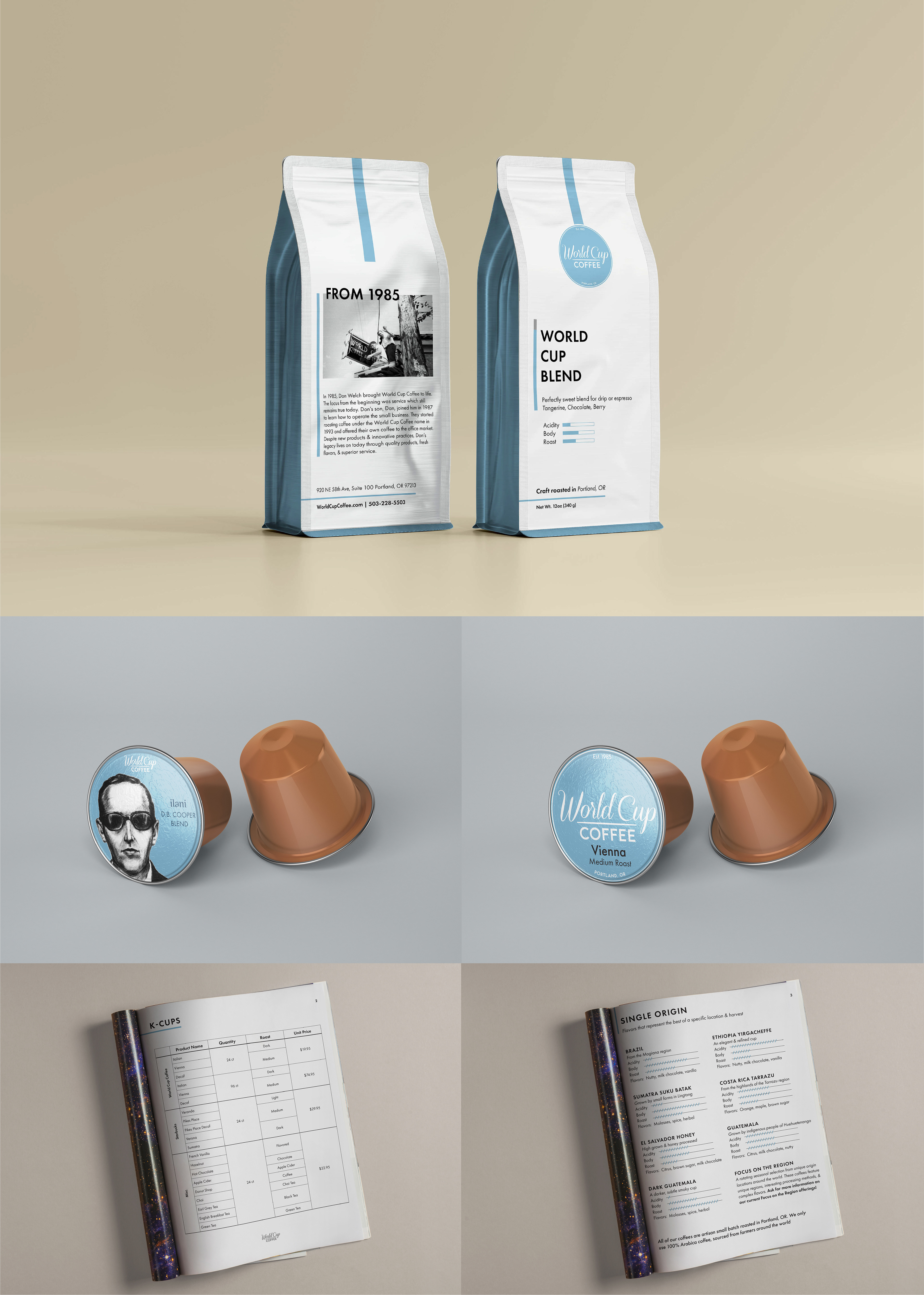
As a part-time graphic designer for this coffee service brand, I was asked to create both branded packaging and informational guides for clients. I based the coffee bag on their previous logo and business card design which featured a very minimal and simple layout. To make the coffee information easier to understand in both the bags and coffee sales sheet, I relied on visuals to explain the acidity, body, and roast rather than numbers. The company needed the information to be straightforward which I wanted my design to reflect.
As for the K-Cups, the branding and coffee were the most critical aspects to stand out, so I kept it simple by making the logo and signature blue color the focus.